ohGiGi
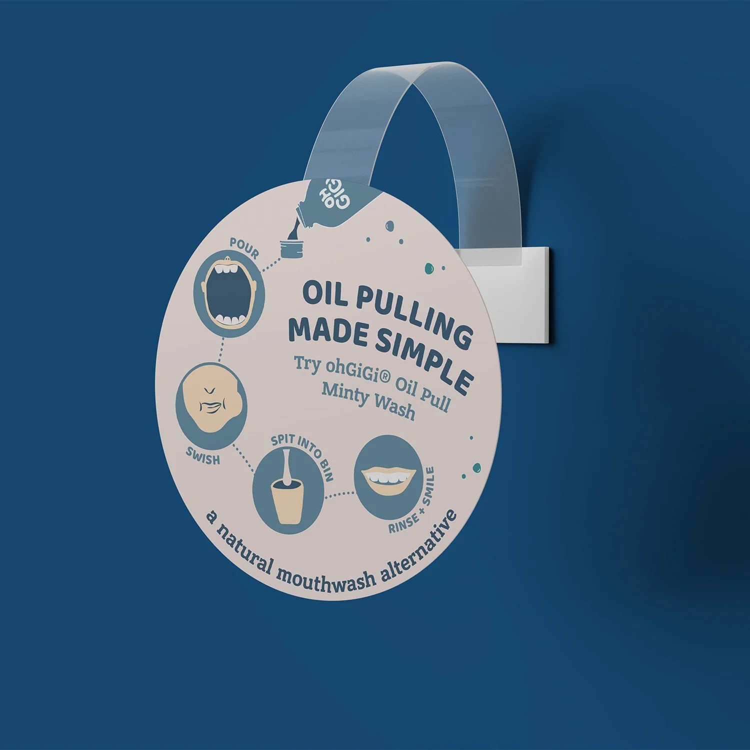
Packaging Design | Signage | Shelf Wobblers
Melbourne-based ohGiGi is changing the way teeth are brushed through their non-toxic, sweetener-free toothpowder.
When they first approached Cultivate Creative to design the label for their new flavour-free toothpowder, the focus was on communicating the product and its values through colour and icons, while integrating seamlessly with the rest of their product labels.
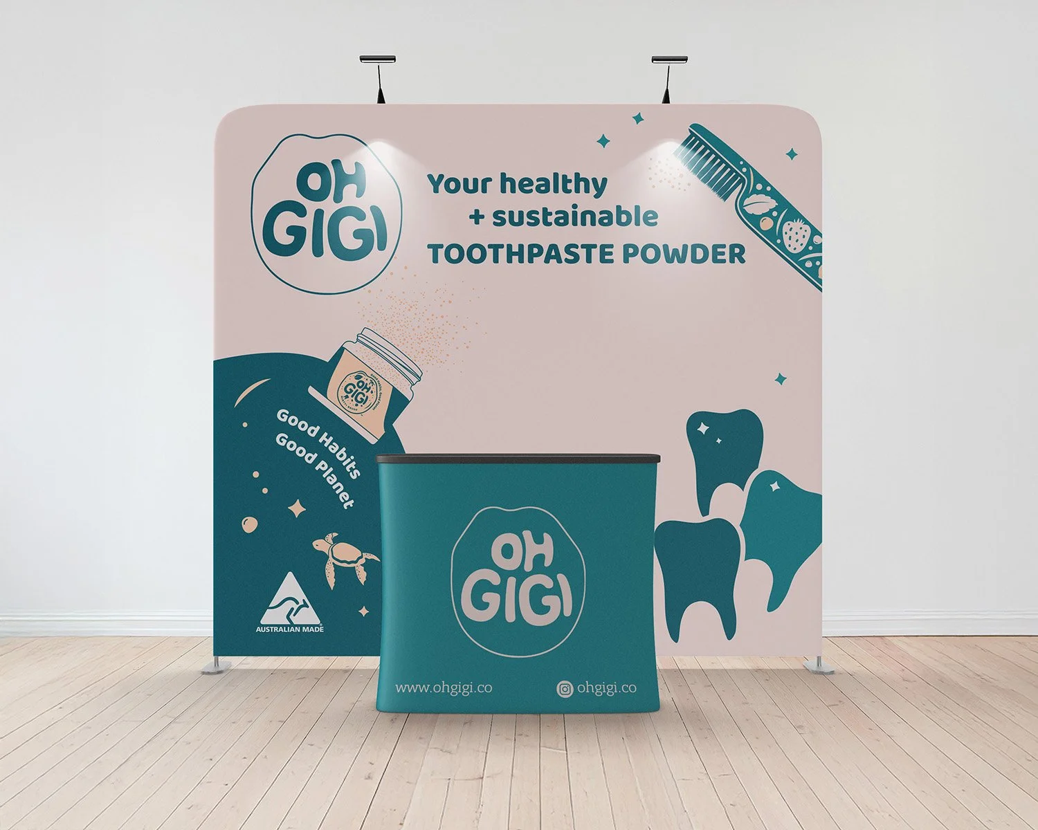
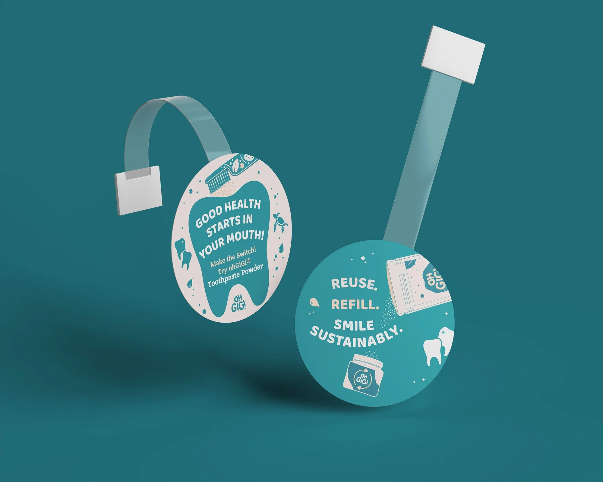
From there, the work with ohGiGi continued, expanding into custom packaging, shelf wobblers, and stall signage.


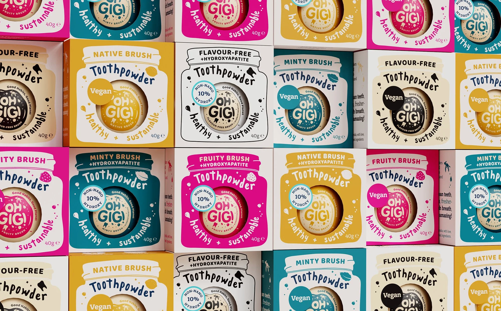
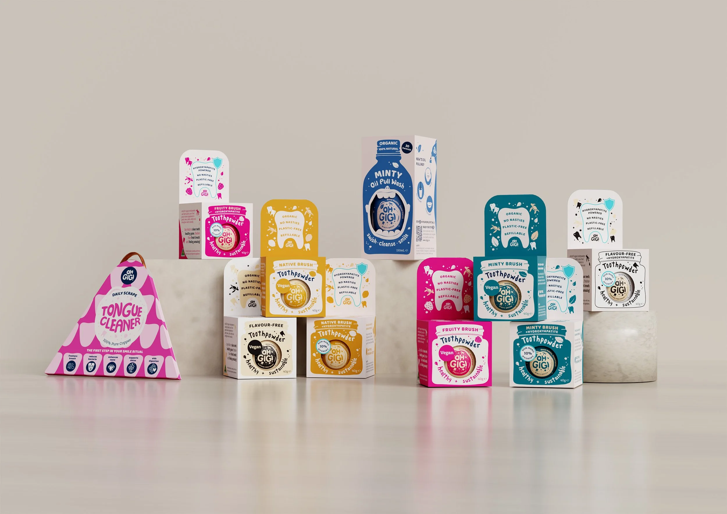
The ohGiGi Oral Care Packaging System breaks the norm when it comes to dental packaging. From bright, eye-catching colours to playful illustrations and typography, every touchpoint was designed to stop customers in their tracks.
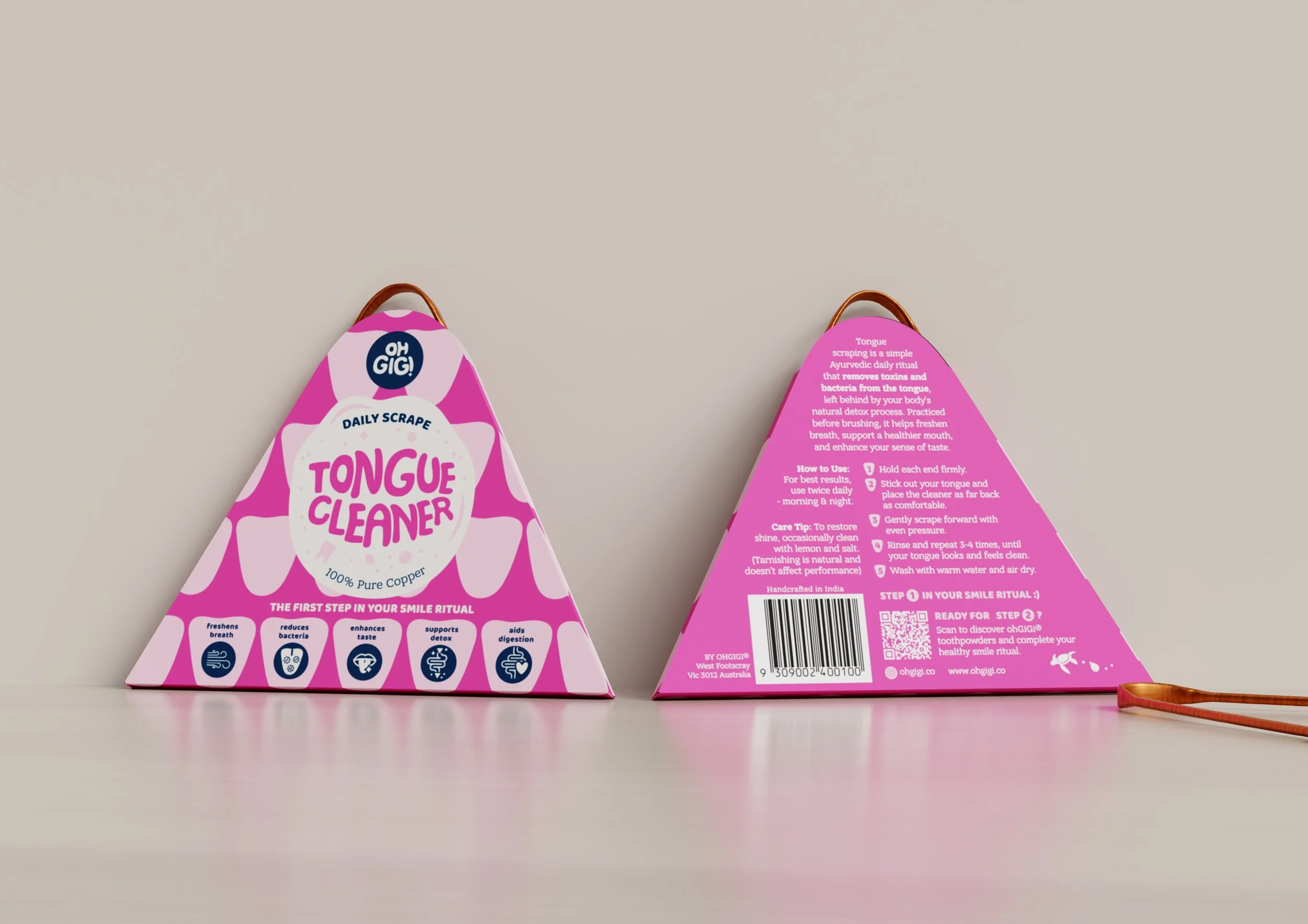
Spanning toothpowders, oil pulls and tongue cleaners, the system reimagines everyday oral care rituals through bold structural forms, educational storytelling and emotionally engaging design. Structural design and cut-out forms serve as communication tools, improving product visibility, comprehension and shelf recognition across the range, while balancing functionality, shelf impact and material-conscious packaging.
Prototyping was a vital part of the process, with several iterations needed to ensure a perfect, functional fit across the range.

"Jess has been an absolute joy to work with! She brought our vision for retail packaging to life, designing the perfect boxes for our toothpowder jars to shine on stockists' shelves."
From the very beginning, Jess took the time to understand our brand values, ensuring that it was at the heart of every design decision. Her attention to detail and thoughtful approach meant every aspect of the packaging was carefully considered, making the entire process seamless - even under a tight timeline.
We couldn’t be happier with the final outcome! The design has not only exceeded our expectations but has also been met with amazing feedback from both our customers and retailers, who absolutely love it. Thank you, Jess!”
Karen Tan, ohGiGi Owner