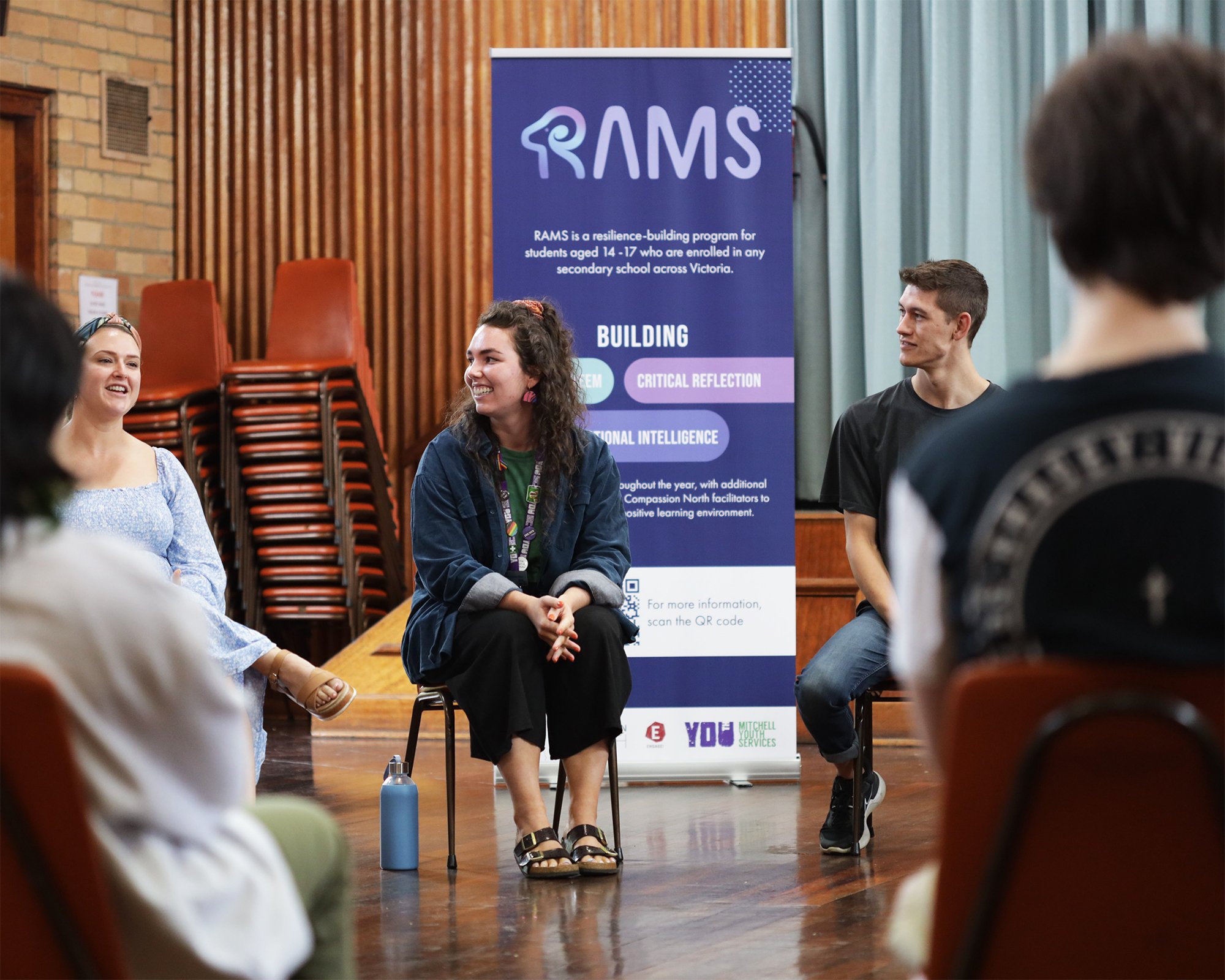
RAMS Program
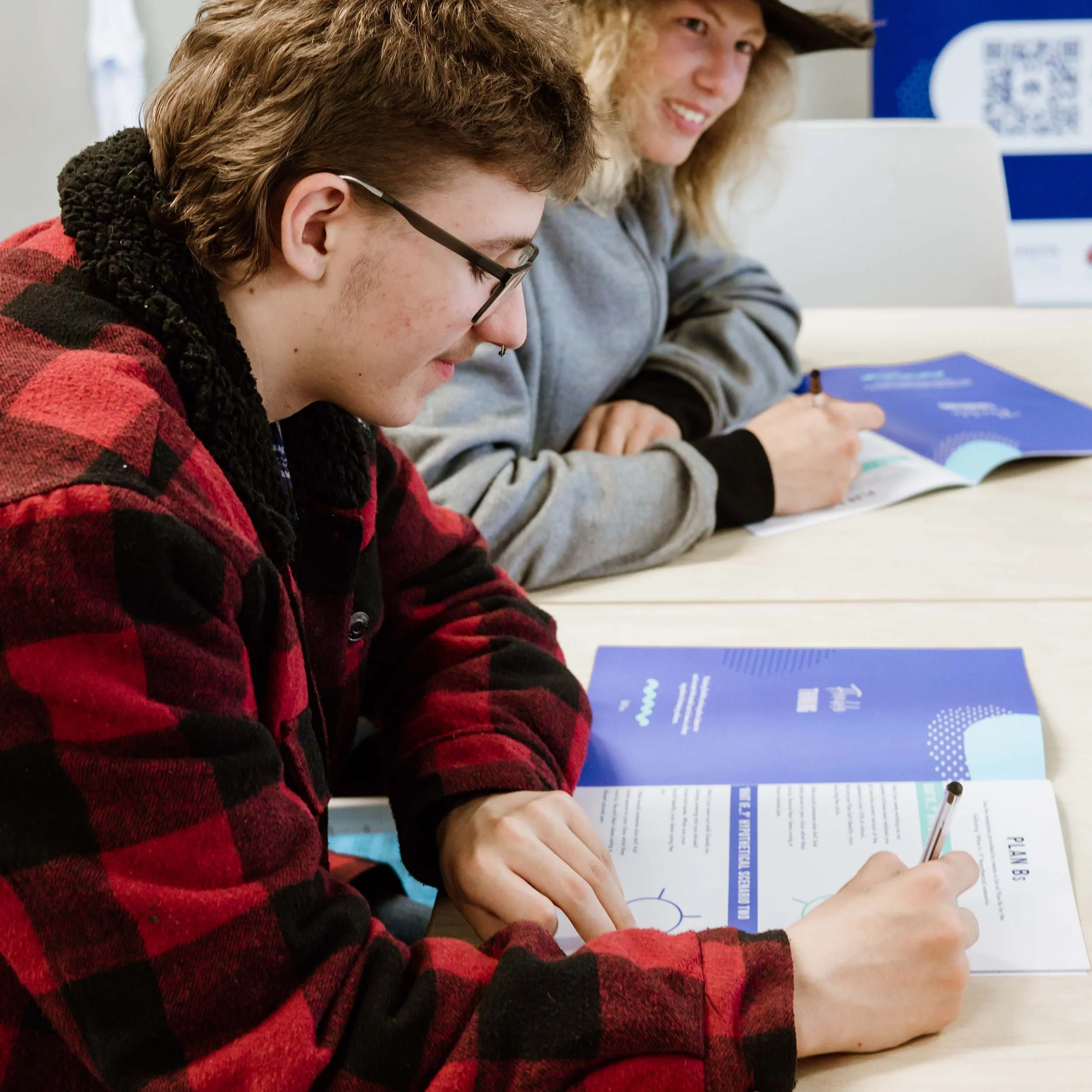
With a mission to build resilience and self-esteem in school students, RAMS runs programs and workshops in schools across Australia.
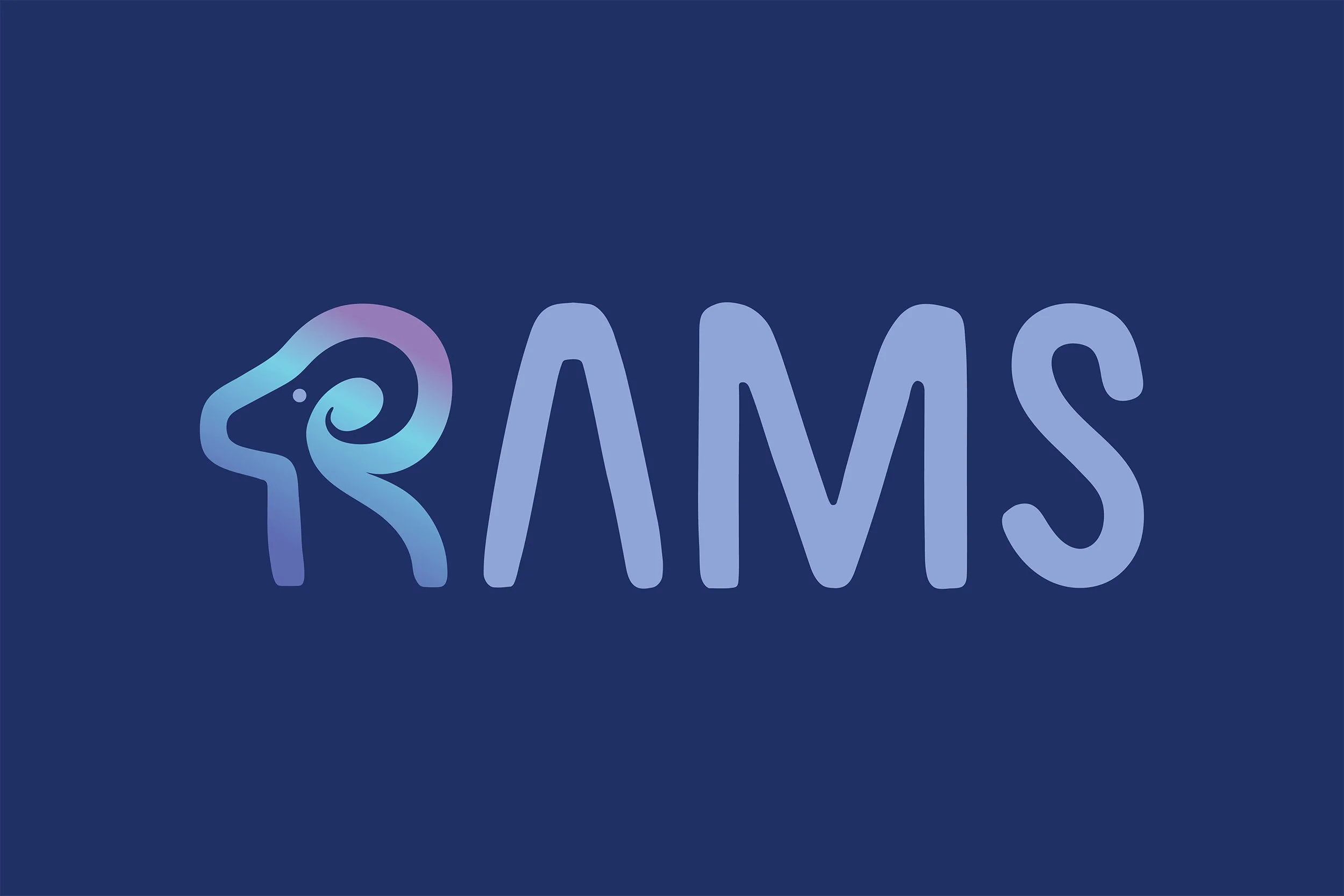
6 years after establishing the program, the RAMS team felt their branding didn’t effectively reach their young audience or represent the organisation’s vision and purpose. The logo expressed resilience as aggressive and angry, rather than as a positive strength.
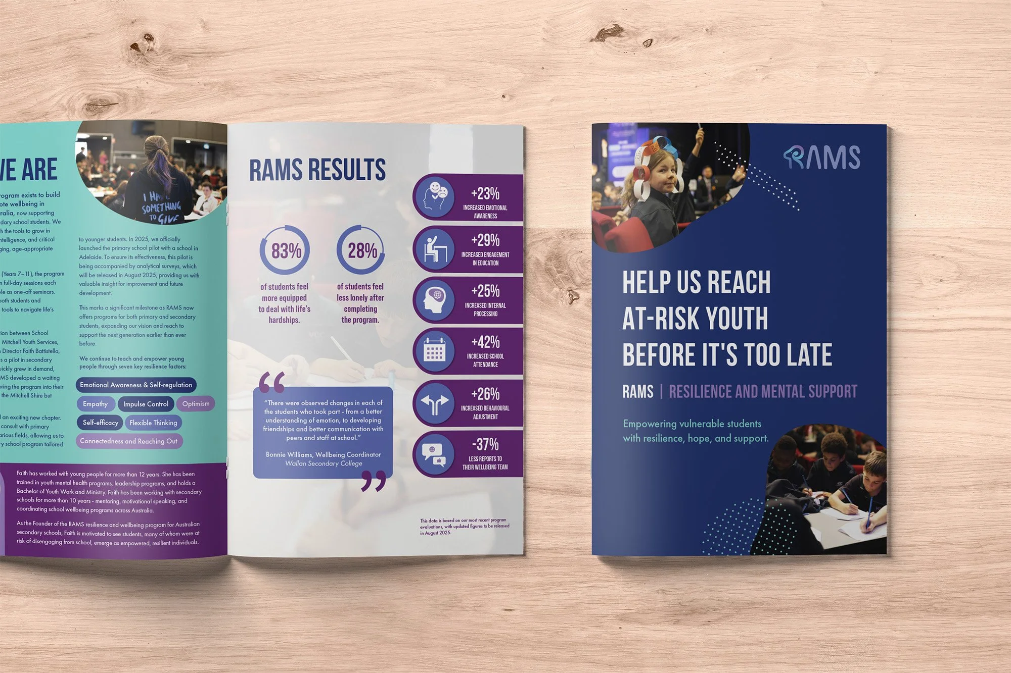
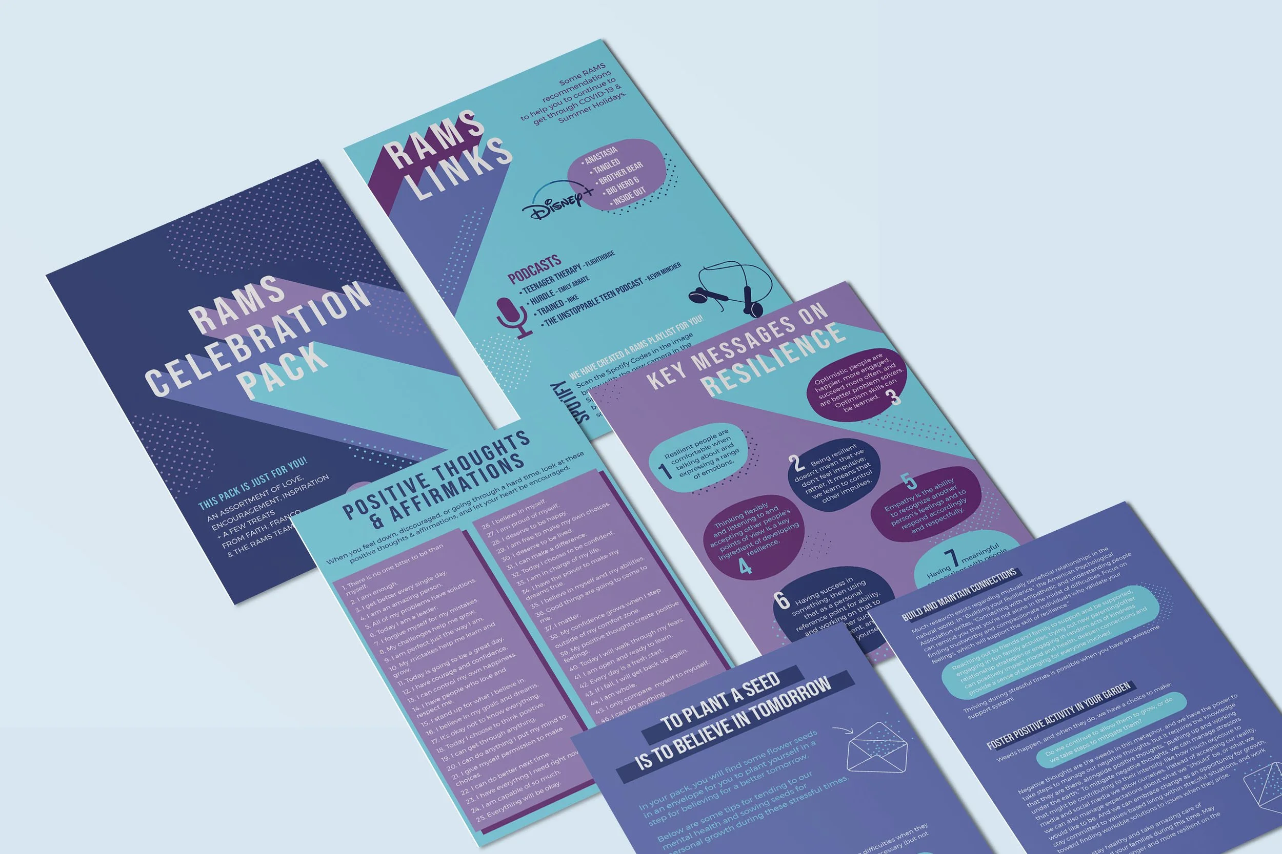
RAMS worked with Cultivate Creative to create a new brand identity that presents the program professionally, yet engages the primary and teenage audience by portraying a fun and energetic presence.
To achieve this, a ram was playfully incorporated into the ‘R’. By using the side view of the ram, it was able to be illustrated in a manner where it depicts strength without having an aggressive expression.
To portray a sense of stability, strength and fun to the teenage audience, blue, purple and aqua were chosen as the primary colours. Blue, associated with confidence, trust, and stability, brought the professional, educational aspect to the branding. Purple, often linked with royalty, enhances the message of worthiness to the students, who are having their self-esteem fostered throughout the program. And finally, aqua, a youthful colour that brings an openness and energy to the palette.
Before Rebranding

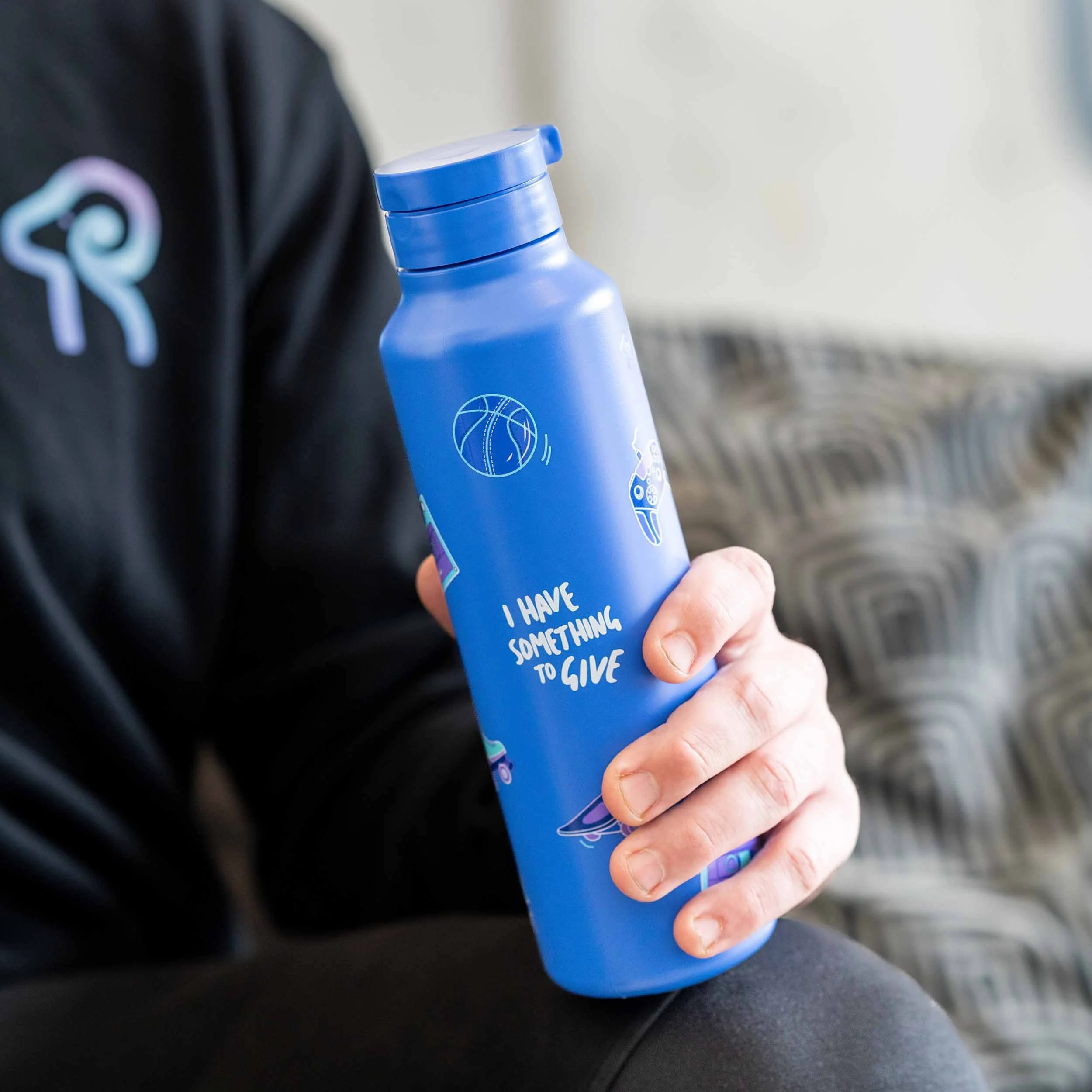
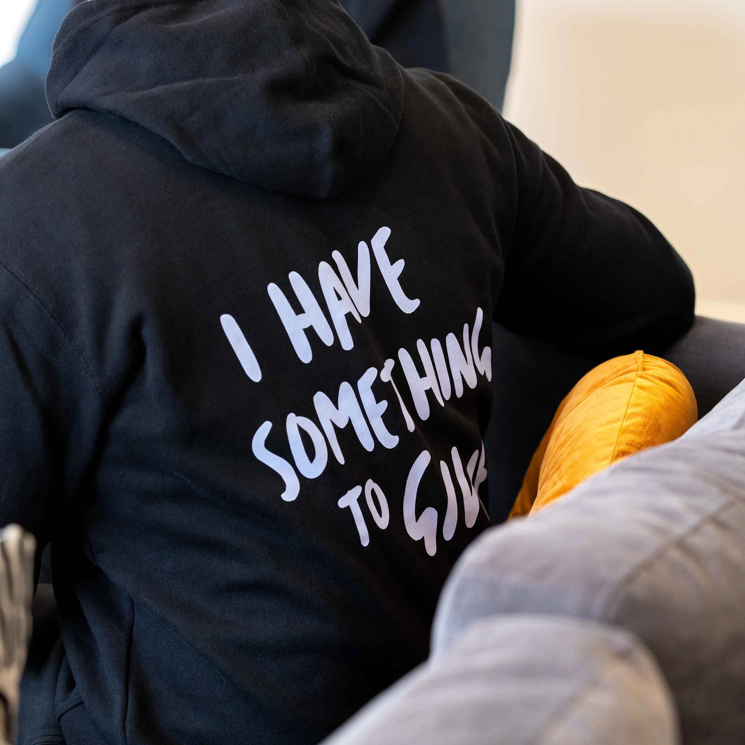
After Rebranding

“[Cultivate Creative] was able to resurrect our branding and bring RAMS back to life!
Jess has great communication, was easy to work with, and we’ve loved working with her since.”
Faith Natoli, RAMS Founder & Director