Specht
Branding | Business Cards | Email Marketing | Seo
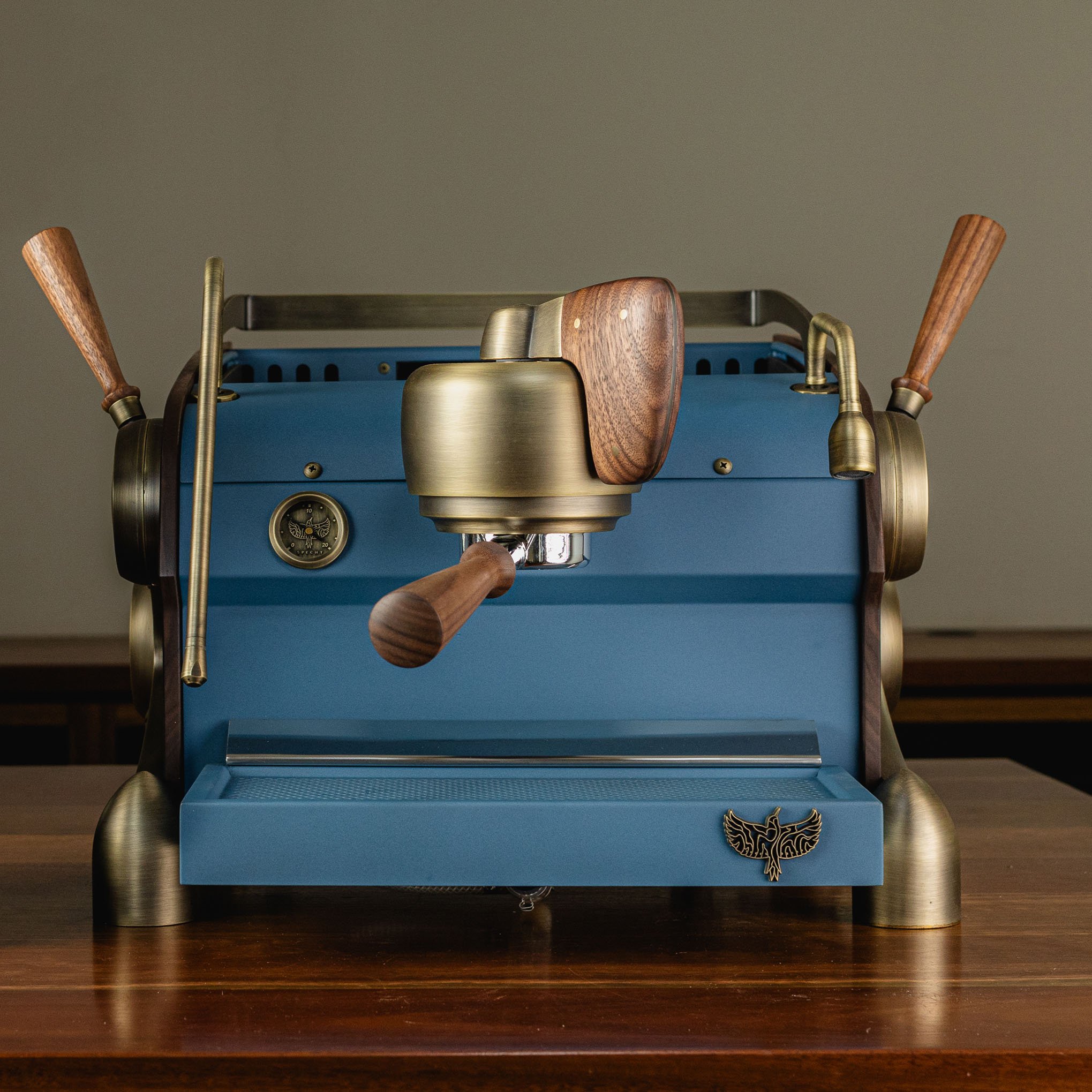
Melbourne-based Specht craft bespoke, luxury espresso machines found in homes around the world.
When founder Daniel approached Cultivate Creative for a rebrand, it was clear that the original identity no longer reflected the brand’s evolution or the refined craftsmanship of their machines. With a growing international presence, Specht needed a visual identity that aligned with its reputation for quality, design, and innovation.
The brief was clear: to create a visual identity as distinctive, handcrafted and sophisticated as the machines themselves.
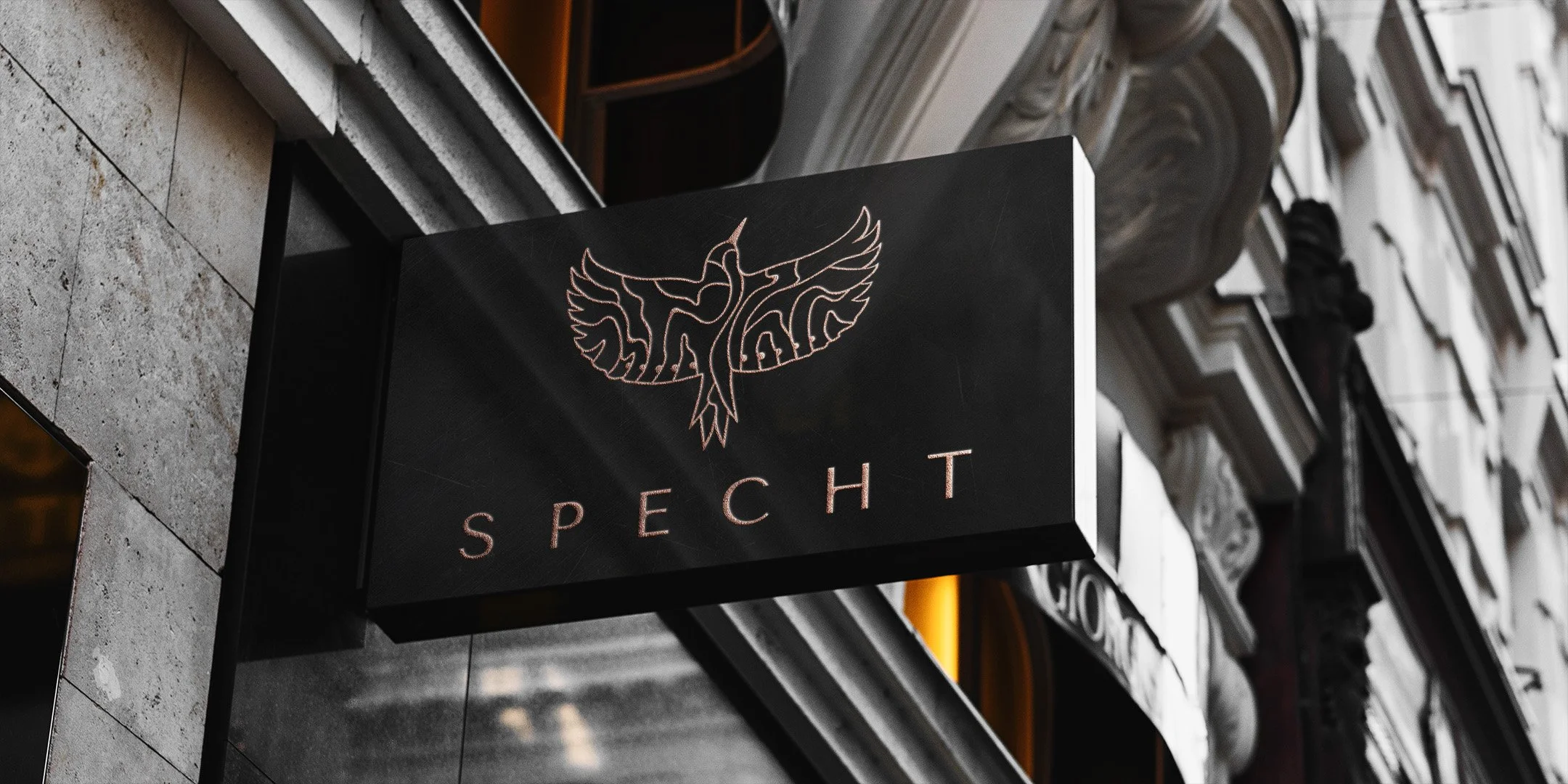

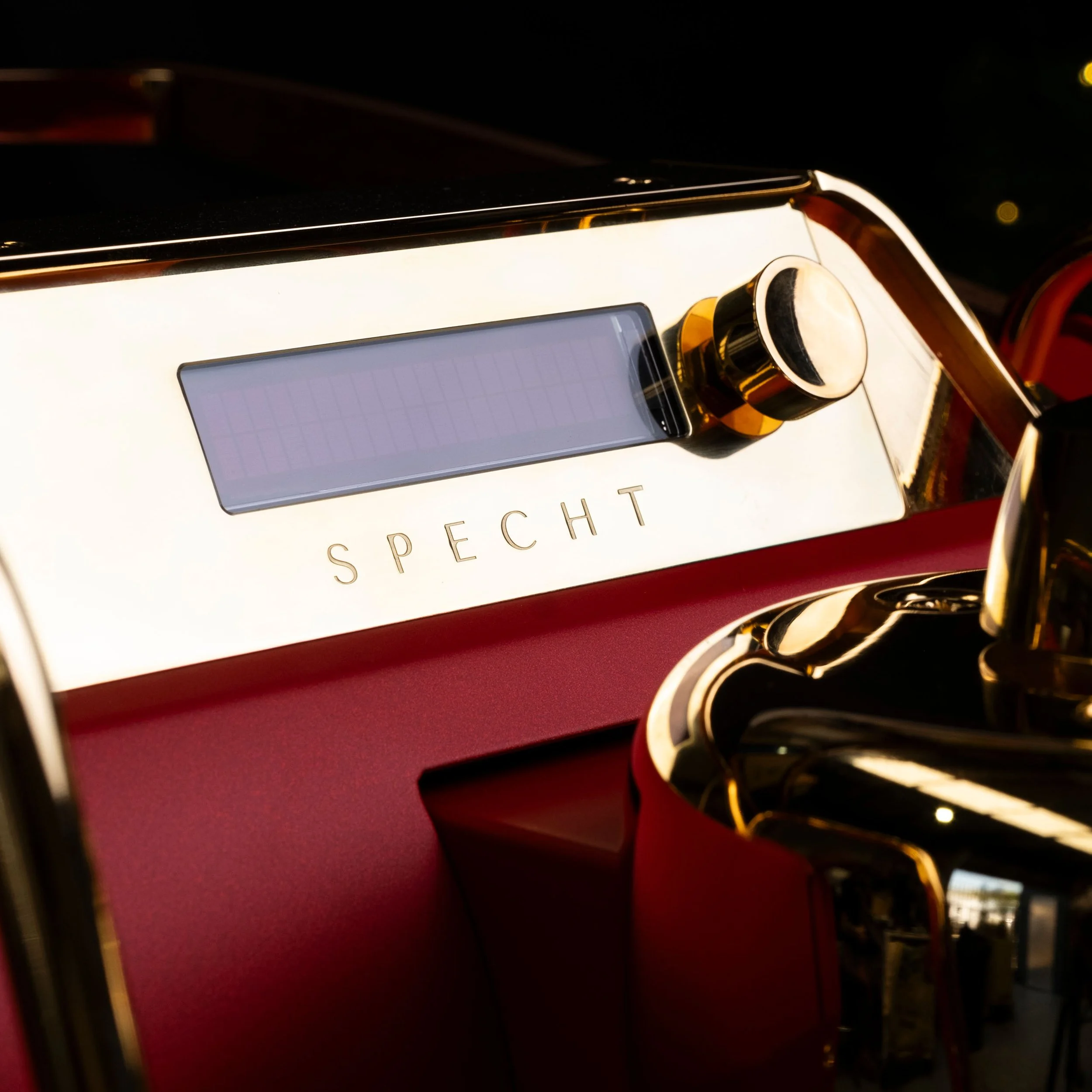
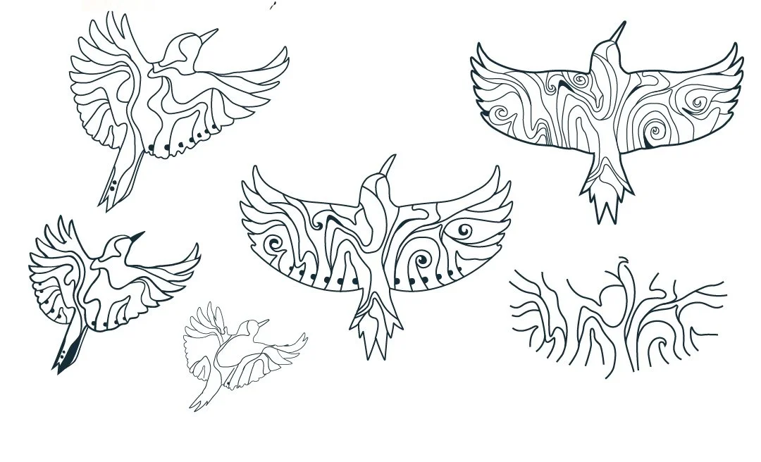
Named after the German word for woodpecker, it was important to maintain the connection with the business’s heritage and the timber craftsmanship Specht is known for. To achieve this, a detailed woodpecker logo with a timber-grain pattern was designed to be the primary mark.
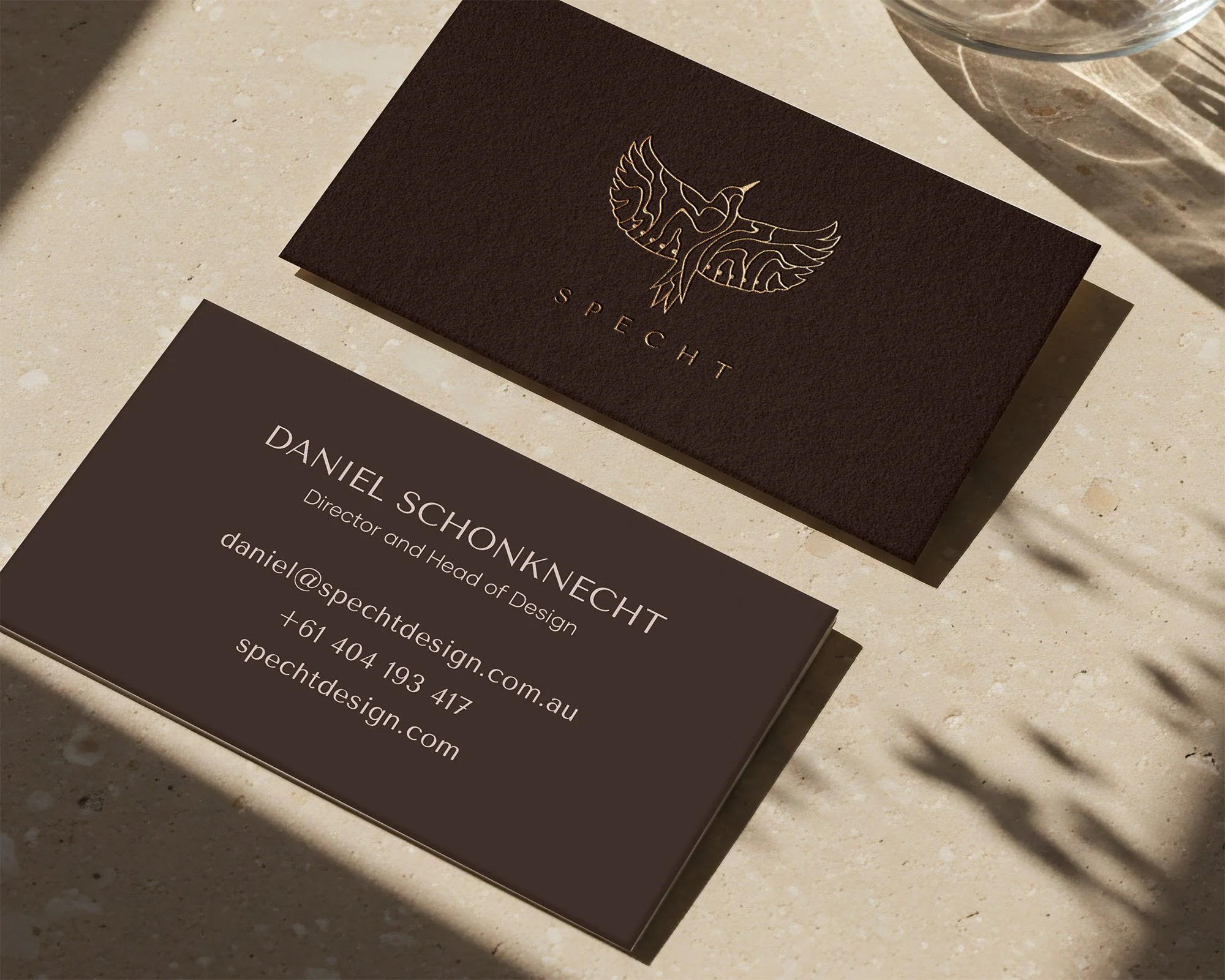
The wordmark was crafted to reflect Specht’s values when the woodpecker isn’t present. The font was customised with refined rounded details and spaced lettering, resulting in a clean, luxurious feel that pairs perfectly with the icon.
Unique to Specht, the identity included specific formats such as a brass badge logo for the machines and a scaled version for small steam knobs - presented as alternate logos within the identity suite.


"To say our experience with Jess was truly special is an understatement.
Our brand is very unique, so our branding had to match. Jess understood our needs so incredibly well and nailed our vision! She is a very talented graphic designer and I highly recommend her to anyone looking to rebrand!”
Daniel Schonknecht, Specht Owner